Responsibility:
Directed, designed, and managed the redesign of the secured account management system for American Express. Evaluated the previous platform, reset core goals of the account pages, and produced the fully redesigned experience.
Overview:
I joined American Express (UXD) in March of 2013 to help direct and redesign the consumer facing experience. In an effort to remove agency spend across various parts of the company, I evaluated how anyone can use their account, check on balances, make payments and control every aspect of their credit card.
For the mass majority of online banking/account management services, incredibly dated experiences lacking a responsive framework and basic functionality are common. After evaluating all of the secured areas of the website, my team and I worked alongside Digital Customer Experience (DCE), to figure out how to best approach each page, reduce the amount of repetitive information, simplify the amount of time it took for a consumer to utilize specific functionalities and set the vision for the look and feel.
An incredible amount of time was spent prototyping, reading through user research, watching user testing and revising on concepts until we had something that appeased company leadership.
Additional stages of the website and its expanding functionality are set to release in the future, covering the broad range of American Express credit cards and providing an even more enhanced account experience.
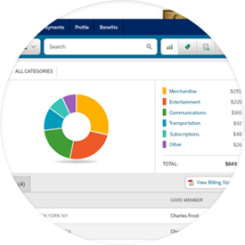
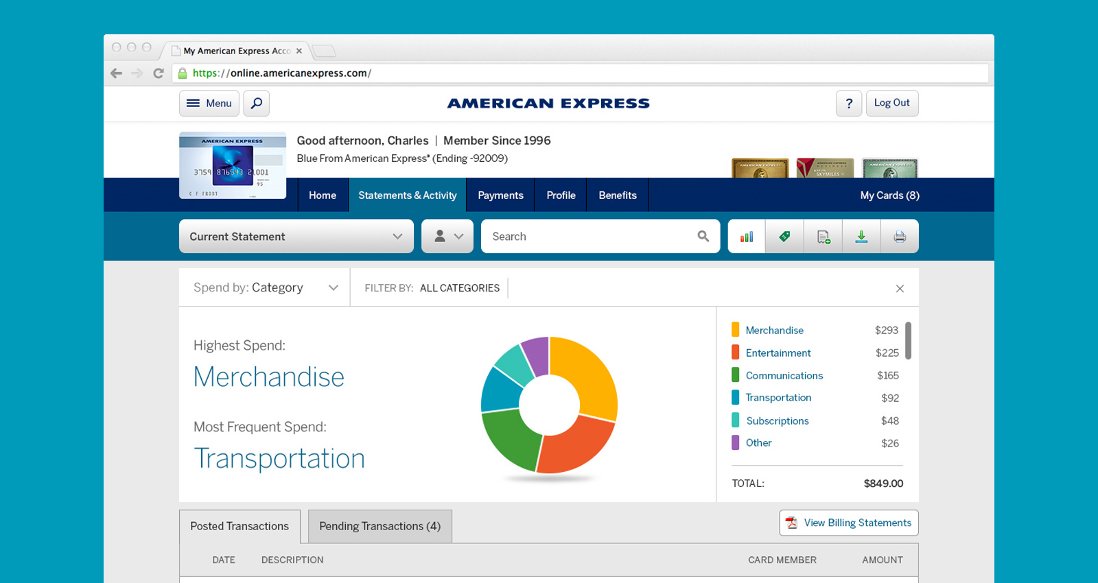
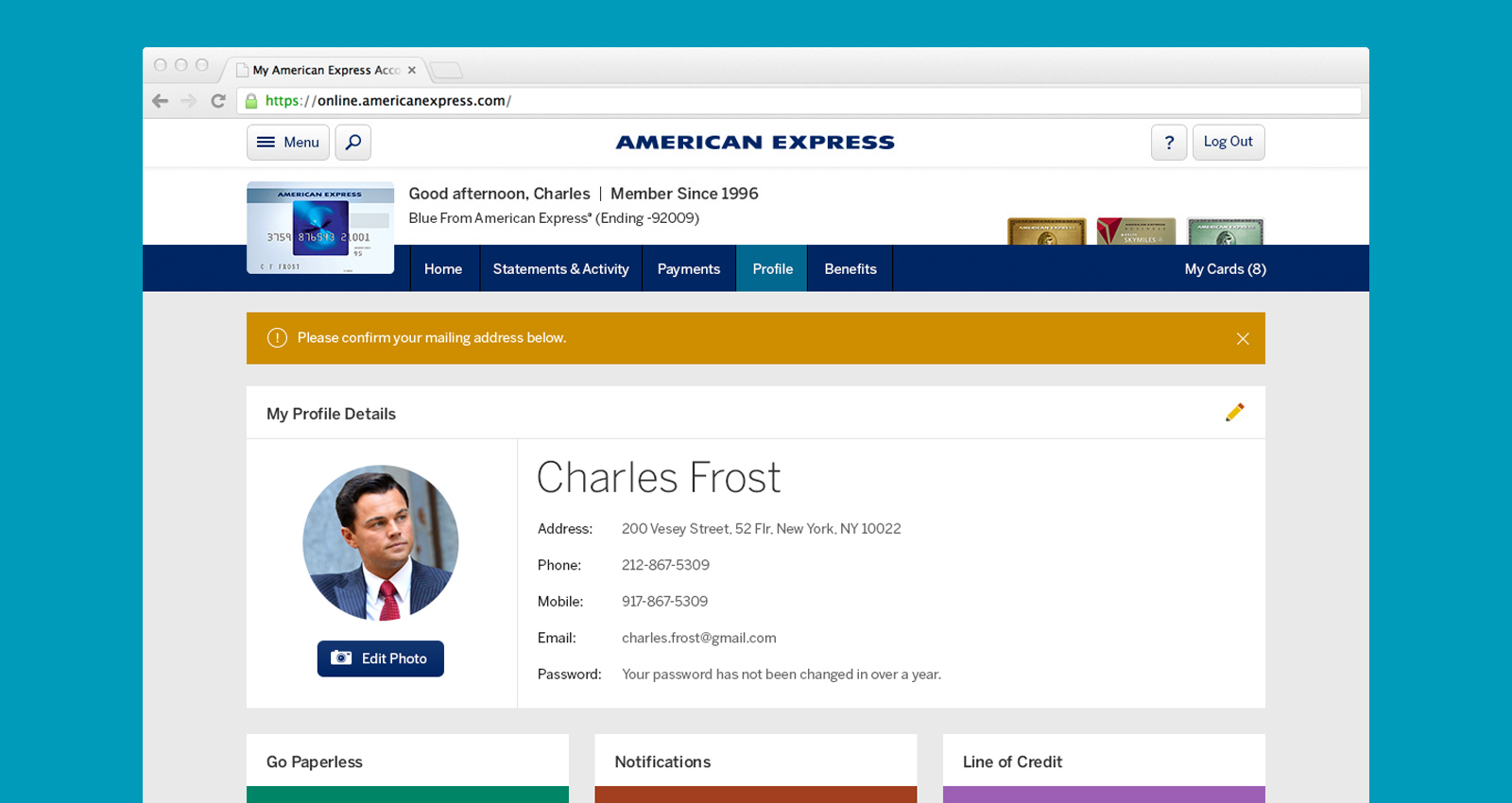
Visually Focused Data
The previous version of the secured experience lacked any sort of visual identifiers for a user’s spend history, charges, payments and other fundamentally important data sets. With the new layout, we surfaced more simplified data to bring a user’s transactions and information to a more prominent placement. Graphs were capable of drilling deeper into segments of spend, in turn allowing users to narrow the types of charges that they are interested in viewing.
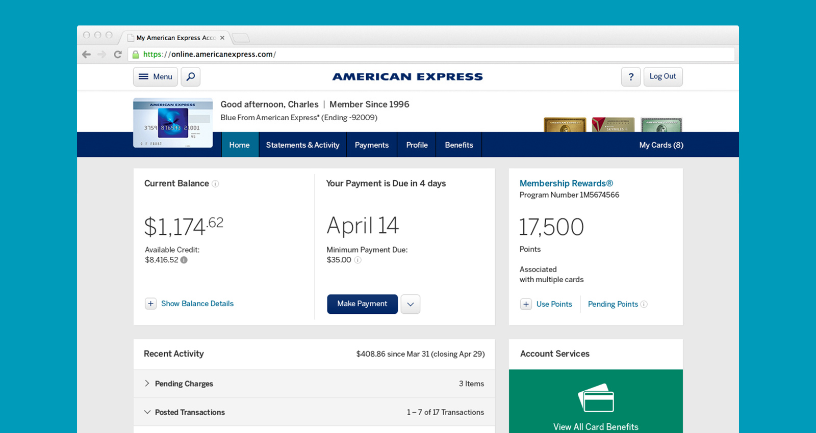
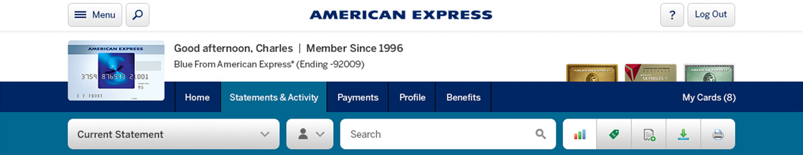
Responsive Tile Design
In order to help build a responsive framework that could be used by all branches of the company, tile design (sometimes referred to as card layout) was selected for look and feel. The tiles allowed us to selectively batch specific components, lay them out by priority and easily scale and move them as needed for larger and smaller breakpoints.
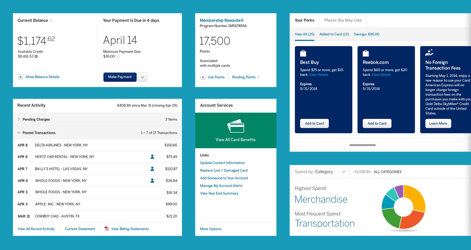
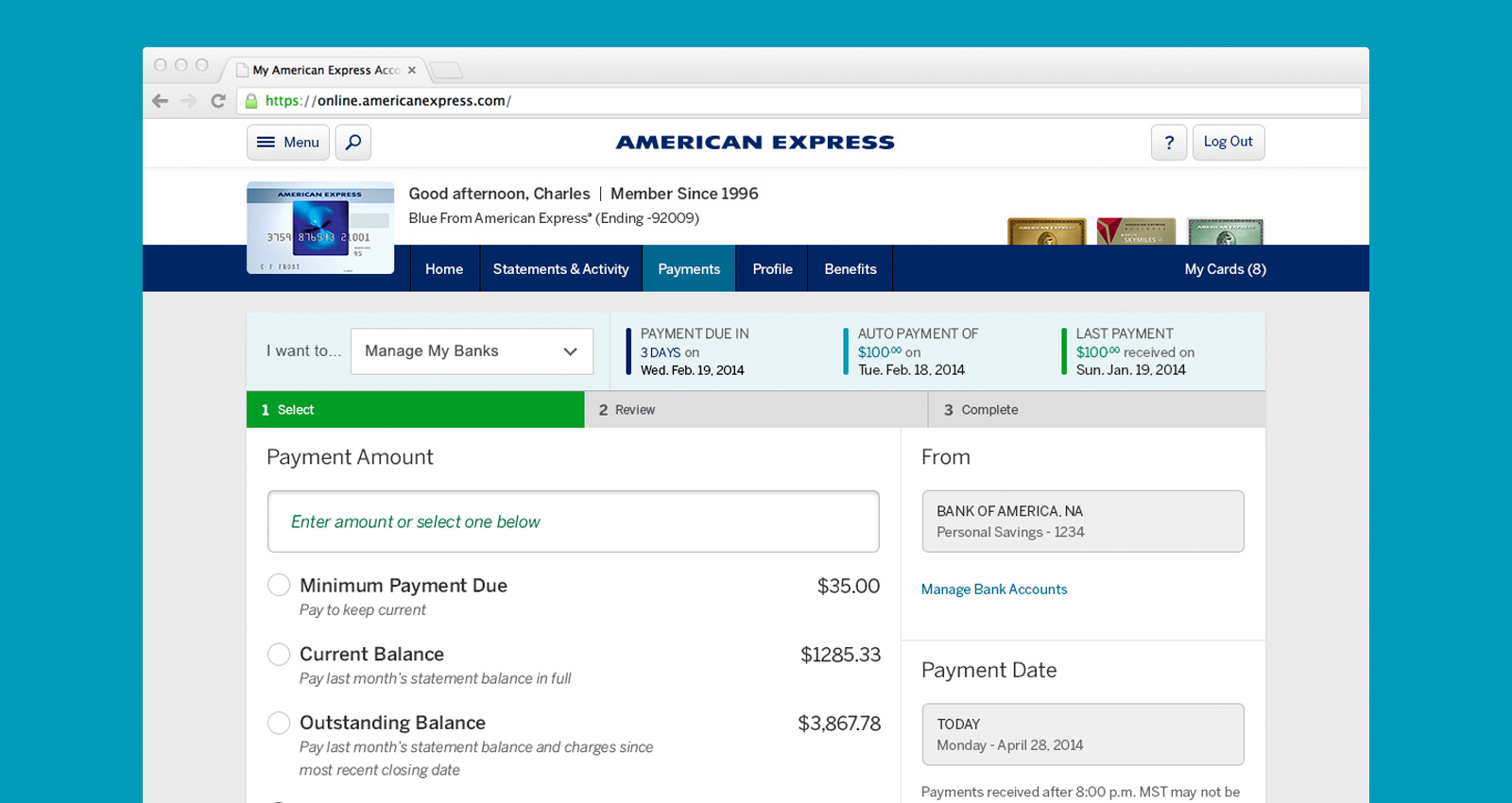
Utility & Usability
Currently, card holders access their American Express online account for two main reasons, to pay their bill and to review account activity. The work that I focused on most related to E-statement, with which an end user reviewed this large sum of data based on charges to their account. I designed a docking utility bar to allow easy access to all tool based functionality.
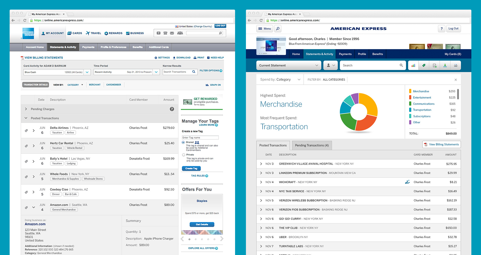
Declutter & Organize
A lot of focus had been given to decluttering the existing website. This meant evaluating over 10 years of work, testing what users truly needed from their online secured accounts, and then finally rebuilding the page with a prioritized order of content. Below is an example of before (left) and after (right).