Responsibility:
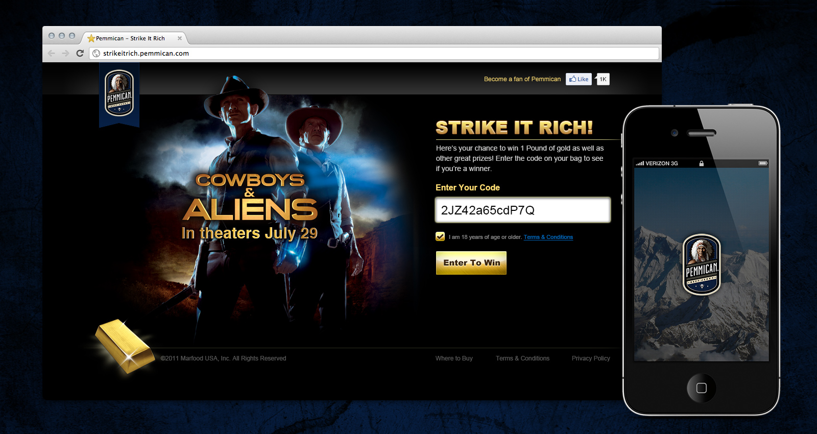
Designed the relaunch of Pemmican brand beef jerky and large-scale marketing efforts. The project responsibilities were extended across web, mobile applications, and mass scale marketing efforts — print and digital. Executed a partnership deal with Cowboys & Aliens, a Universal Pictures production, in an effort to expand brand awareness and reach.
Overview:
A complete overhaul of the Pemmican brand, prompted by an aging company vision and new company initiatives, led to the redesign of its digital and physical properties.
The beef jerky industry is a shady one at best. It’s one of those industries that you look at a wide variety of products, most branded with obscure packaging, and think to yourself “Is that really a piece of beef?” It’s an issue for a lot of companies that sell this product and it’s become the sort of focal point for how people foresee those brands.
The owners of Pemmican were out to provide a higher quality product, and distinguish themselves from their competitors. If you knew what went into most beef jerky products, you might not ever find yourself tempted to purchase another bag. With a major change in the company’s production facilities and meat sources, I accepted a challenge to recreate the new appearance of Pemmican.
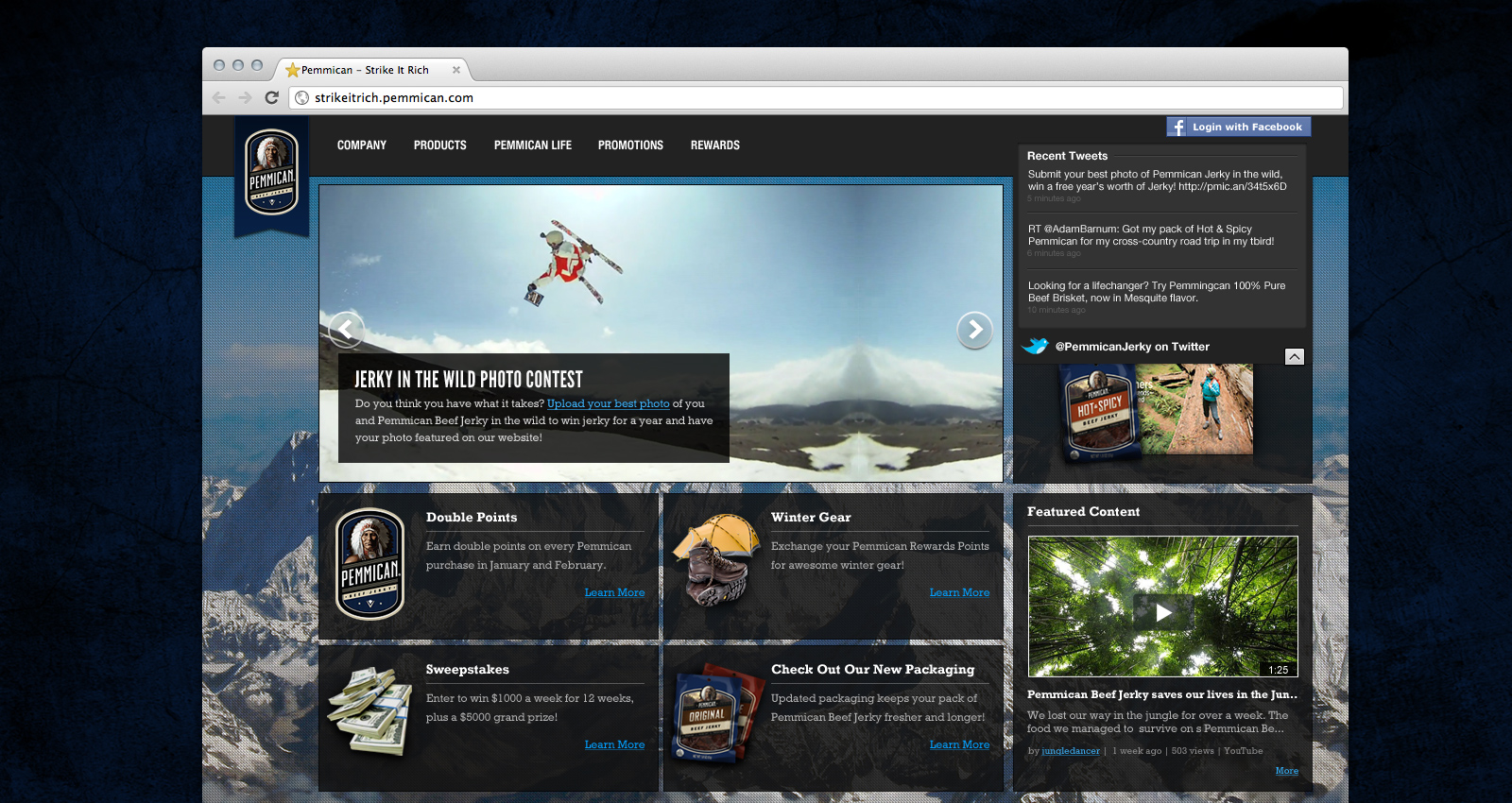
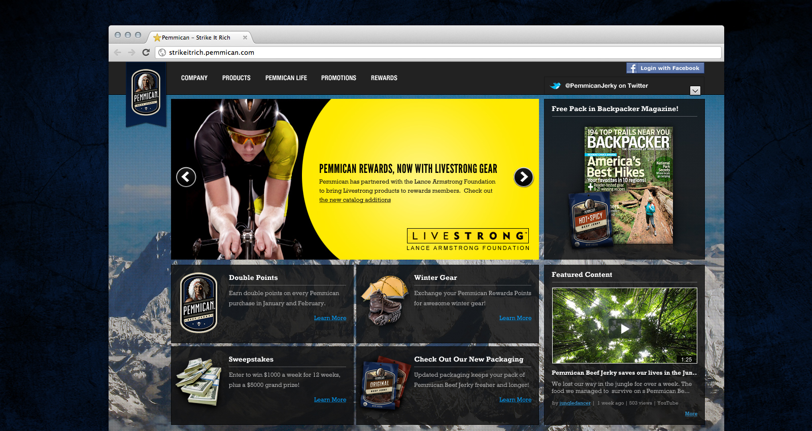
Working with a team of Pemmican stakeholders, I produced a completely revamped website, mobile application, marketing initiative, and brand. The use of royal blue throughout the brand entities, set Pemmican apart from the frequent firecracker aesthetic of most other brands. An enhanced version of the mascot, establishes the company’s original history and character, while a new set of guidelines for content creation turned the focal point of the companies visual communication to something more home grown and organic.
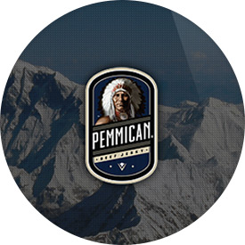
Ensuring A New Brand
Previously known as the truck stop brand of beef jerky, Pemmican set out to obtain a new audience. While competitors focused on Sasquatch based commercials to humor its viewers, Pemmican sought to gain brand recognition with who were considered “The Working Man” — a person with a love for the outdoors, rough terrain and the harder parts of life –, while also conveying a clean and sharp, appearance.
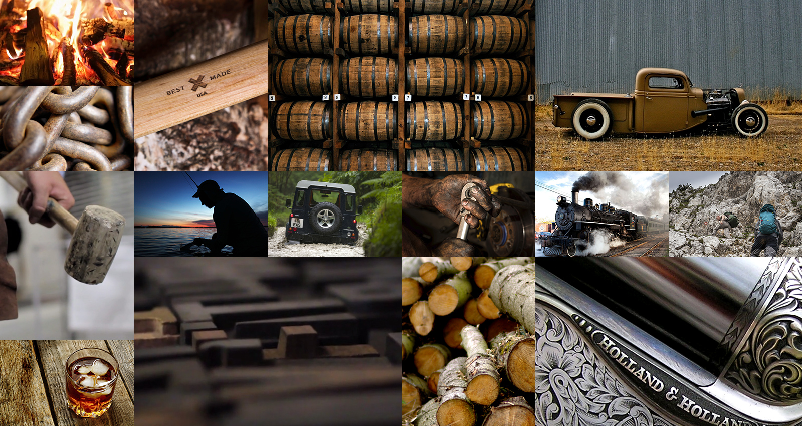
Connecting With Imagery
To set precedence for the new meaning of the company, I put together a set of guidelines for new imagery. A style board was created to convey visual talking points, such as character, age, and workmanship. The natural progression of both the color palettes and photography lent itself to more earth tone based content throughout the brand.