Responsibility:
Directed and designed the user experience and interface from concept to production. Provided multiple levels of interactions and individually designed templates for specific media types. Produced a fully working prototype that was showcased to business owners on both desktop and tablet devices.
Overview:
Coming into 2014, ESPN put forward a new initiative to revise its way of producing consumer facing products, as well as how the brand is perceived.
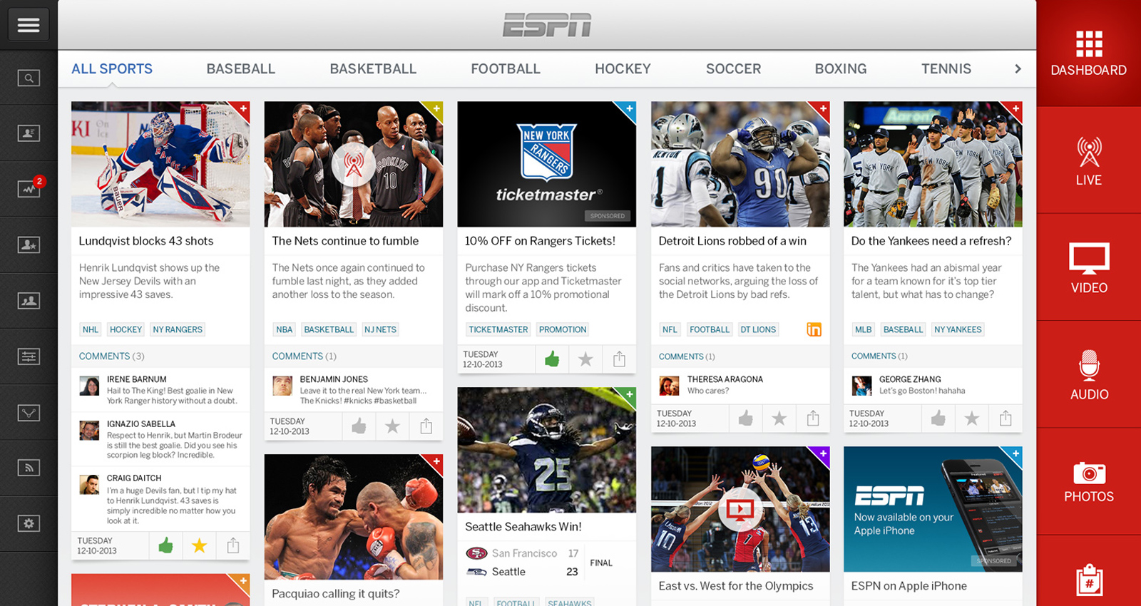
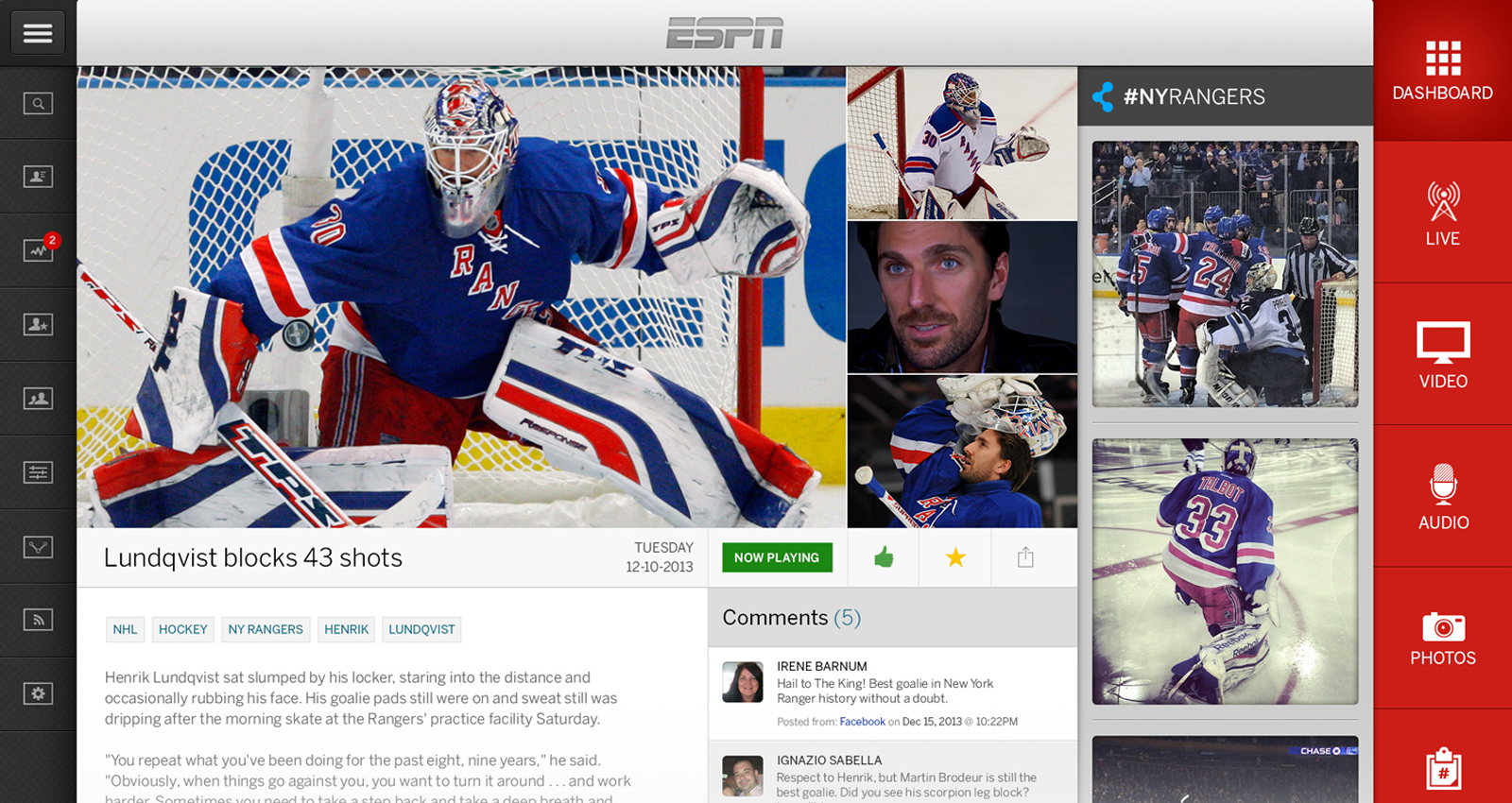
My part in this was to establish a responsive product capable of feeding sports fanatics on any device. I created a tile-based media consumption platform, while rolling out a new look and feel for the “new” ESPN. I was given a new branding kit with a comprehensive history of the signature black and red colors over the last 20 years – how it evolved into a simpler idea. My thought was to create a new platform that would reduce both maintenance and upkeep costs, while also revitalizing the way that people could consume a wide variety of content, including radio-based audio media, live-streaming TV, and even commentary discussion panels.
The end result was a product with the look and feel and utility of a native application that is typically found in iOS or Android, but built around standard web technologies and frameworks. This meant that the platform would have to be responsive in nature, allowing sports enthusiasts to gain access to content on their mobile phone, tablet, computer and television.
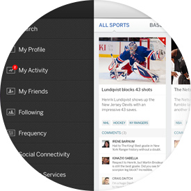
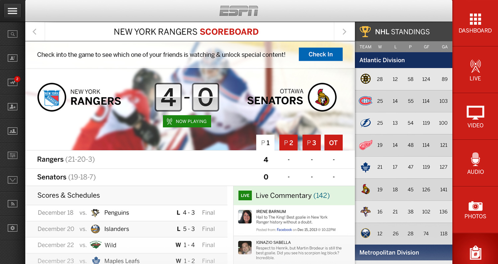
Personalized Utility & Control
As with many media streaming services, the expandability of features and functionality becomes vital in maintaining a growing user base. This is typically done with little thought into how the added functionalities affect the users experience and the UI design. With that in mind, we allowed for expanding menus and optimized views for helping adjust settings within the active window of the application.
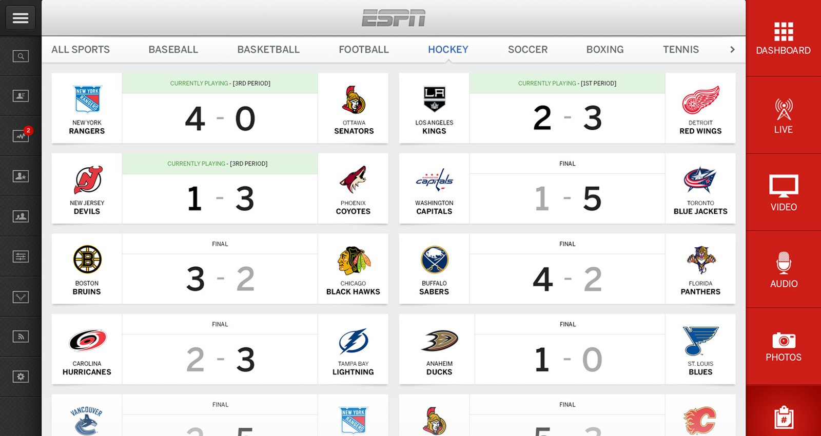
A True Touch-centric Experience
The tile-based modules and full bleed page templates were produced using vector-based shapes and assets in order to accommodate the push for higher resolutions and to ensure the proper scaling of elements for the user’s accessibility. The design lends itself to a friendly user experience on both tablet, as well as mobile.
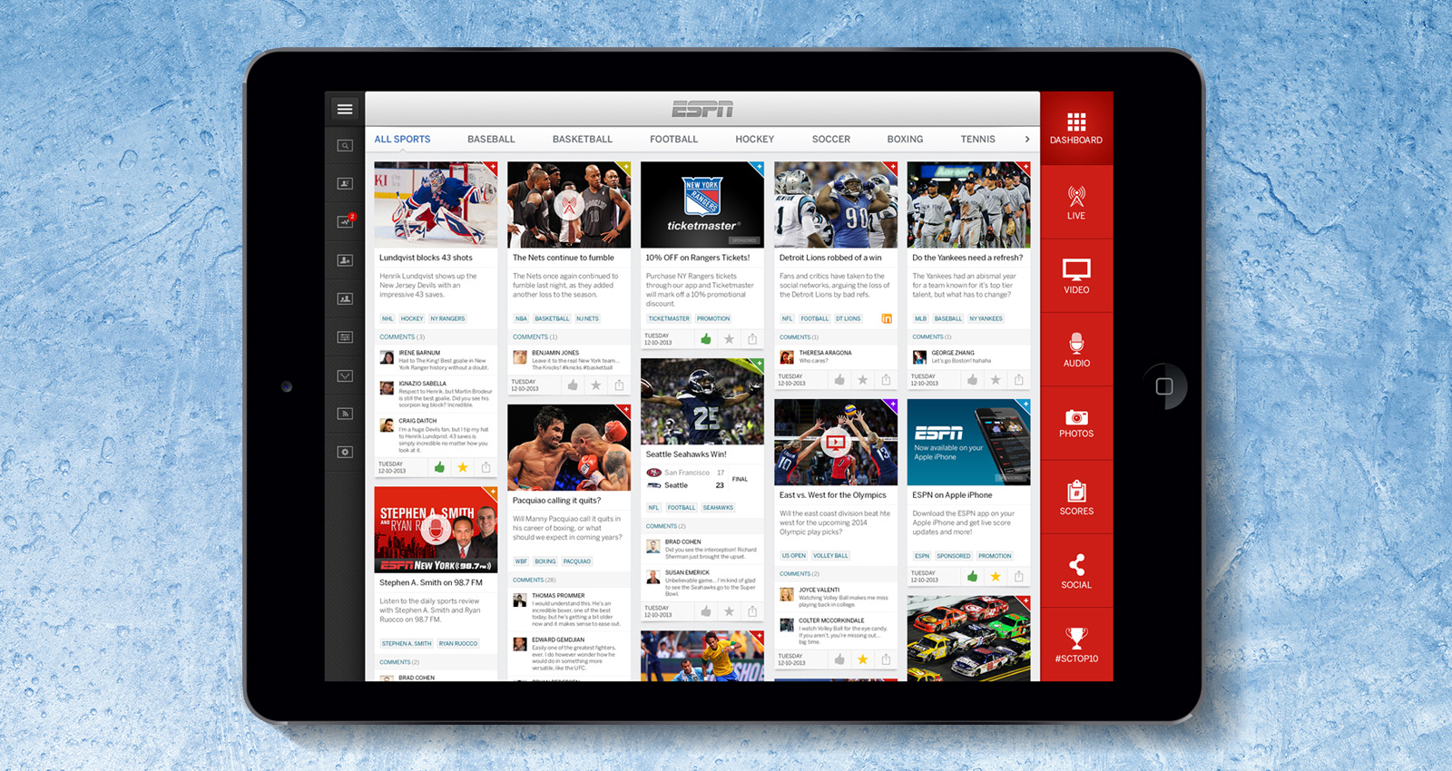
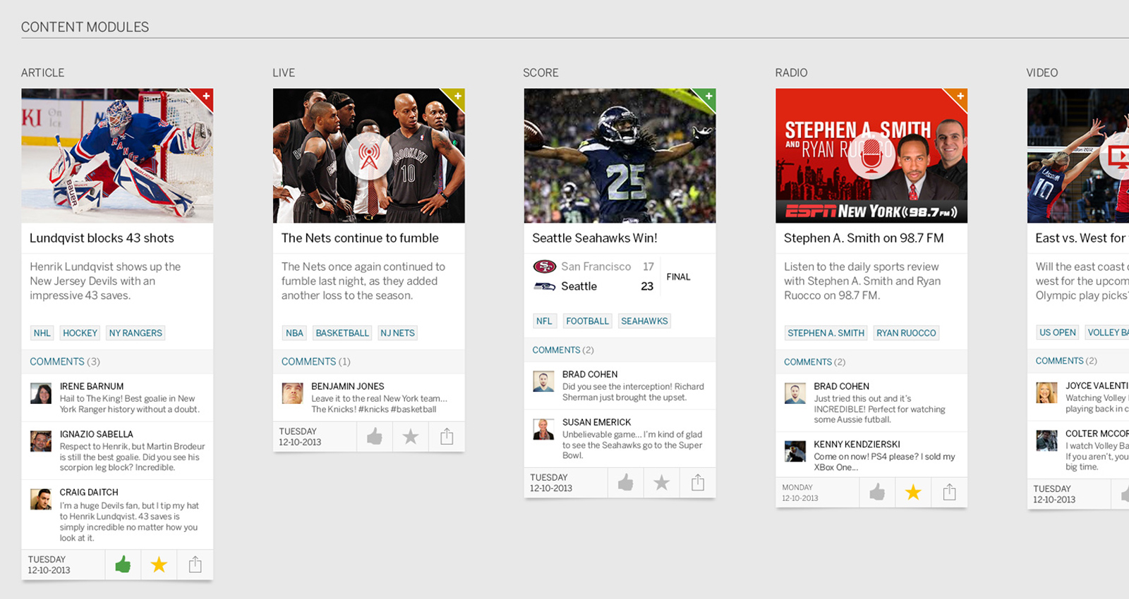
Modular Design
ESPN strongly emphasized the importance of providing the ability to differentiate, filter, sort and interact with a wide variety of media types. I decided that designing the platform around the modular tile approach would work best. This method allows users to tap in the upper right and view flip-side menus and functionality. Anyone could share, add to a queue, read later and more, based on the reverse side of an individual module.